How Educational Channels Design High-Converting YouTube Thumbnails
Learn the thumbnail strategies that top educational channels use to attract viewers. Discover how to balance professionalism with engagement in tutorial and educational content.
How Educational Channels Design High-Converting YouTube Thumbnails
Educational content faces unique challenges on YouTube. Unlike entertainment, where excitement naturally drives clicks, educational thumbnails must promise value while maintaining credibility. The most successful educational channels have developed specific strategies that balance authority with accessibility.
The Educational Thumbnail Challenge
Building Trust While Creating Interest
Educational viewers seek reliable information. Thumbnails must communicate expertise without appearing boring or academic. The balance between authority and engagement defines successful educational channel design.
Differentiating from Competitors
Educational niches often contain multiple channels covering identical topics. Your thumbnail must communicate why your explanation is worth watching over alternatives.
Setting Accurate Expectations
Educational content promises learning outcomes. Thumbnails that misrepresent complexity or depth disappoint viewers and damage long-term channel health.
Core Design Principles for Education
Clarity Over Cleverness
Educational thumbnails prioritize clear communication over creative flourishes:
- Straightforward imagery representing content
- Text that clearly states the topic
- Visual metaphors that enhance understanding
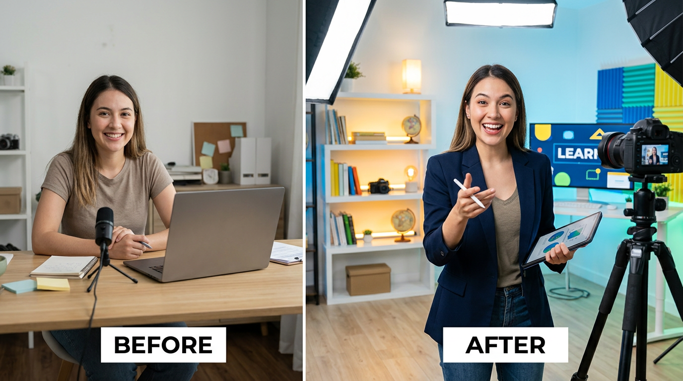
Figure 1: Before and after transformation in educational content, showing learning progres...
Rule of Thumb: If a viewer can't determine the video's topic from the thumbnail alone, the design fails.
Authority Signals
Elements that establish expertise:
- Professional presentation of the creator
- Clean, organized visual design
- Relevant credentials or achievements displayed
- Quality graphics and imagery
Accessibility Indicators
Elements that welcome viewers:
- Friendly, approachable imagery
- Complexity indicators (beginner, advanced, etc.)
- Time investment signals ("5 minutes," "quick guide")
- Outcome previews (before/after, problem/solution)
Text Strategies for Educational Content
Outcome-Focused Phrasing
Emphasize what viewers will learn rather than the topic itself:
- Weak: "Introduction to Excel"
- Strong: "Master Excel in 10 Minutes"
Specificity Creates Value
Specific details promise specific value:
- Weak: "Python Tutorial"
- Strong: "Build Your First Python App"
Number Usage
Numbers communicate concrete value:
- Time investment ("10 Minutes")
- Quantity of tips ("5 Techniques")
- Difficulty level ("3 Levels")
- Results achieved ("100% Score")
Question Format
Questions create curiosity and promise answers:
- "Why Does This Work?"
- "Which Method Is Better?"
- "How Do Professionals Do It?"
Visual Elements for Educational Thumbnails
Before and After
Visual transformations prove educational value:
- Show the starting point
- Show the achieved result
- Make the difference obvious
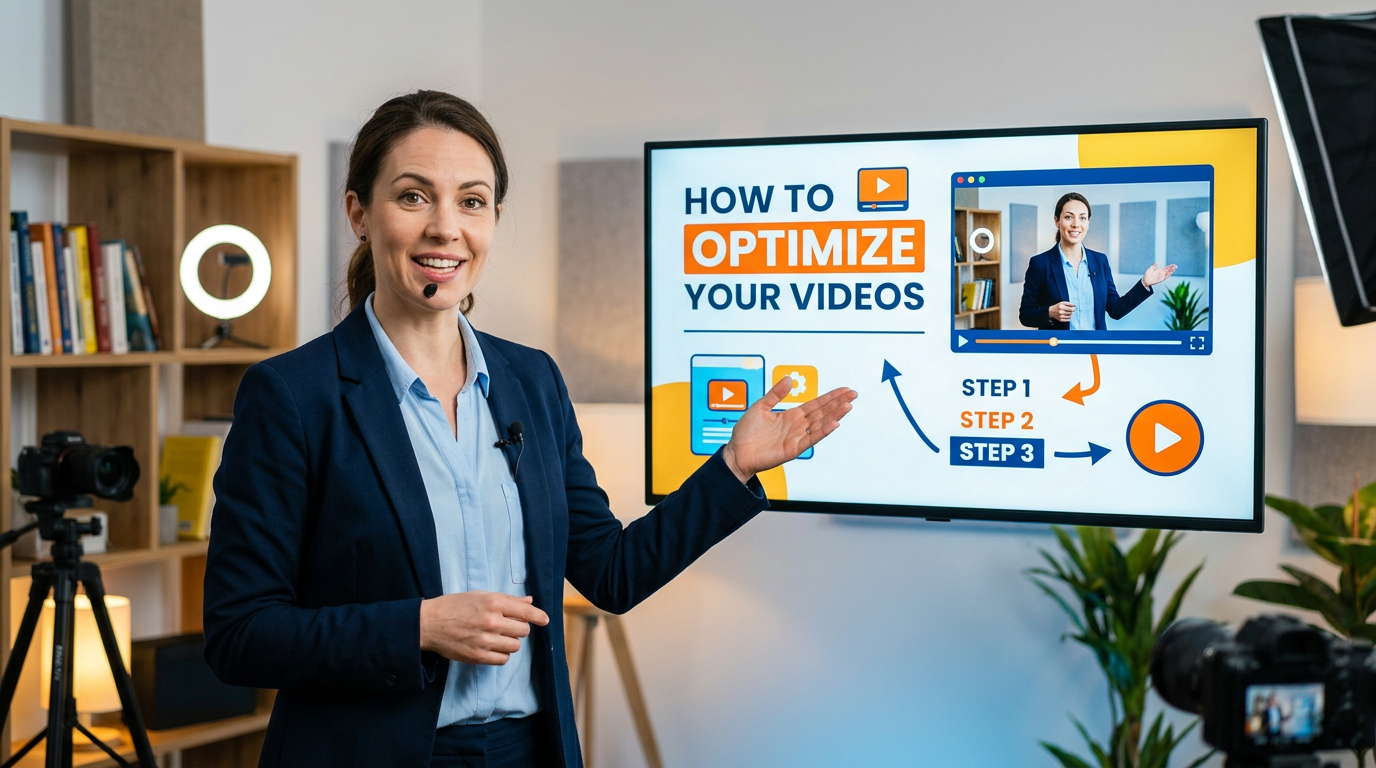
Screen Content Previews
For software tutorials:
- Show the interface clearly
- Highlight key elements
- Include recognizable software indicators
Concept Visualization
For theoretical content:
- Diagrams that simplify complex ideas
- Visual metaphors for abstract concepts
- Illustrations that aid understanding
Document and Material Previews
For physical skills or crafts:
- Show materials clearly
- Preview finished projects
- Include scale indicators
Creator Presentation Strategies
The Instructor Shot
Including the creator builds personal connection:
- Position: Side of frame, not obscuring content
- Expression: Confident and approachable
- Attire: Professional but relatable
- Consistency: Same presentation across thumbnails
Authority Through Demonstration
Show expertise through action:
- Hands demonstrating techniques
- Interaction with subject matter
- Confident body language
Expression Guidelines
- Confidence: Assured smile, direct eye contact
- Engagement: Leaning in, showing interest
- Clarity: Pointing at key elements
- Discovery: Surprised excitement at solutions
Subject-Specific Strategies
Technology and Software
Key Elements:
- Clear interface shots
- Highlighted features
- Before/after comparisons
- Device context (desktop, mobile, tablet)
Color Approach: Professional blues, clean whites, subtle accents
Science and Mathematics
Key Elements:
- Visual representations of concepts
- Formulas and diagrams
- Real-world applications
- Lab or study context
Color Approach: Academic blues, greens, clean backgrounds
Language Learning
Key Elements:
- Text in target language
- Visual associations
- Cultural context elements
- Progress indicators
Color Approach: Vibrant, friendly colors representing different languages
Business and Finance
Key Elements:
- Charts and graphs
- Currency symbols
- Professional settings
- Growth indicators
Color Approach: Professional blues, greens (money associations), gold accents
Creative Skills
Key Elements:
- Work in progress shots
- Material showcases
- Technique demonstrations
- Finished examples
Color Approach: Creative, varied colors reflecting the craft
History and Humanities
Key Elements:
- Historical imagery
- Maps and timelines
- Document representations
- Era-specific visual elements
Color Approach: Aged tones, sepia influences, rich deep colors
Balancing Depth and Accessibility
Skill Level Indicators
Include complexity signals:
- "Beginner" / "Advanced" badges
- Prerequisite mentions
- Time investment estimates
Avoiding Misleading Simplicity
Don't oversimplify complex topics:
- Accurately represent difficulty
- Use appropriate terminology
- Show realistic results
Creating Appropriate Expectations
Match thumbnail promise to video content:
- Don't overpromise quick mastery
- Don't understate valuable depth
- Align visual complexity with actual content
Layout Templates for Education
The Standard Layout
Structure:
- Left side: Creator or demonstration
- Right side: Topic text or visual element
- Bottom: Supporting details or branding
The Comparison Layout
Structure:
- Split screen showing before/after or comparison
- Clear dividing line or arrow
- Labels for each side
The Focus Layout
Structure:
- Central key element (interface, diagram, result)
- Surrounding supporting information
- Minimal distractions
The Question Layout
Structure:
- Visual question mark or questioning imagery
- Topic preview
- Answer teased but not revealed
Common Educational Thumbnail Mistakes
Over-Academic Design
Too formal creates perception of boring content:
- Problem: Textbook-style thumbnails
- Solution: Add personality and visual interest while maintaining credibility
Underestimating Visual Appeal
Educational doesn't mean boring:
- Problem: Plain, minimal effort designs
- Solution: Invest in quality visuals that enhance content appeal
Missing Value Proposition
Viewers need to know what they'll gain:
- Problem: Topic-only thumbnails without benefit indication
- Solution: Include outcome or benefit in design
Ignoring Non-Expert Viewers
Beginners often search educational content:
- Problem: Jargon-heavy thumbnails intimidating newcomers
- Solution: Include accessibility indicators and welcoming elements
Building Educational Authority Through Consistency
Channel Brand Development
Develop recognizable elements:
- Consistent color scheme
- Unified typography
- Recurring layout structures
- Recognizable creator presentation
Series Branding
Create visual systems for content series:
- "Basics" series has consistent style
- "Advanced" series has differentiated design
- Related topics share visual elements
Quality Consistency
Maintain professional standards:
- High-resolution imagery
- Clean graphic design
- Proper spelling and grammar
- Professional typography
Testing and Optimization for Education
Educational-Specific Metrics
Monitor:
- Click-through rate by topic type
- Watch time relative to video length
- Subscriber conversion from videos
- Search ranking for educational terms
A/B Testing Approaches
Test educational-specific elements:
- Outcome phrasing vs. topic phrasing
- Creator presence vs. absence
- Complexity indicators vs. simple designs
- Before/after vs. single-image approaches
Learning from Competitors
Study successful educational channels:
- Note thumbnail patterns in your niche
- Identify what differentiates top performers
- Adapt successful strategies to your style
Conclusion: Teaching Through Design
Educational thumbnails must teach viewers what to expect before they click. Clear communication, credibility signals, and outcome visualization create thumbnails that attract the right viewers for the right reasons.
Remember that your thumbnail represents your teaching. Professional, clear, value-focused designs attract viewers seeking quality education. Invest in your thumbnail strategy as an extension of your educational mission.
The best educational thumbnails make viewers feel they'll learn something valuable by watching. Achieve that feeling through honest representation, clear communication, and professional presentation that honors both your content and your audience's time.
jackyi
YouTube content strategist and thumbnail optimization expert. Passionate about helping creators grow their channels through data-driven design and SEO best practices.