YouTube Thumbnail Fonts: Best Typography Choices for Maximum Click-Through Rates
Discover the best fonts for YouTube thumbnails that maximize readability and click-through rates. Learn typography principles, font pairing strategies, and mobile optimization techniques.
YouTube Thumbnail Fonts: Best Typography Choices for Maximum Click-Through Rates
Typography in YouTube thumbnails is often the difference between a clicked video and a scrolled-past one. While many creators focus on colors and images, font selection quietly determines whether your message even registers with potential viewers.
This guide reveals the typography strategies that top-performing channels use to ensure their thumbnail text captures attention and communicates value instantly.
Why Font Choice Matters More Than You Think
The 1-Second Decision Window
Viewers make click decisions in under one second. During this brief window, your thumbnail text must accomplish three things: capture attention, communicate value, and create desire. The wrong font choice fails at step one—text that's hard to read doesn't get read at all.
Research in cognitive psychology shows that familiar fonts process faster in the brain. When viewers encounter thumbnail text, their brains automatically assess readability before conscious comprehension begins. Fonts that fight this process create friction that costs you clicks.
Mobile Display Constraints
Over 70% of YouTube watch time occurs on mobile devices. Your carefully crafted thumbnail shrinks to roughly two inches wide on phone screens. Fonts that look clear on your 27-inch monitor may become illegible blobs at mobile sizes.
This reality eliminates many font choices entirely. Decorative scripts, thin serifs, and tightly spaced typefaces that work in print become visual noise at thumbnail sizes. Mobile-first font selection is no longer optional—it's essential.
The Best Fonts for YouTube Thumbnails
Category 1: Bold Sans-Serifs
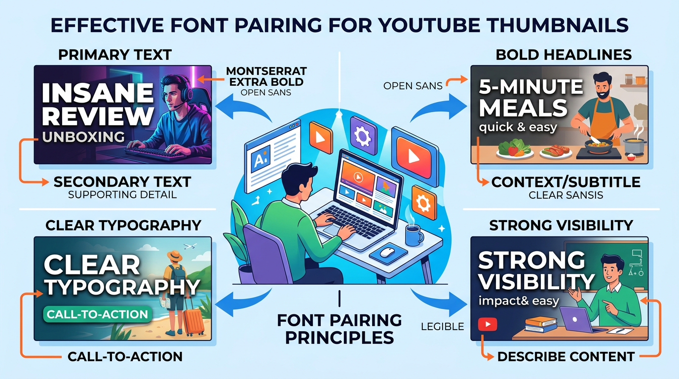
Figure 1: Font pairing examples for YouTube thumbnails, primary text and secondary text de...
Sans-serif fonts dominate thumbnail design for good reason. Their clean lines and consistent stroke weights maintain clarity at any size.
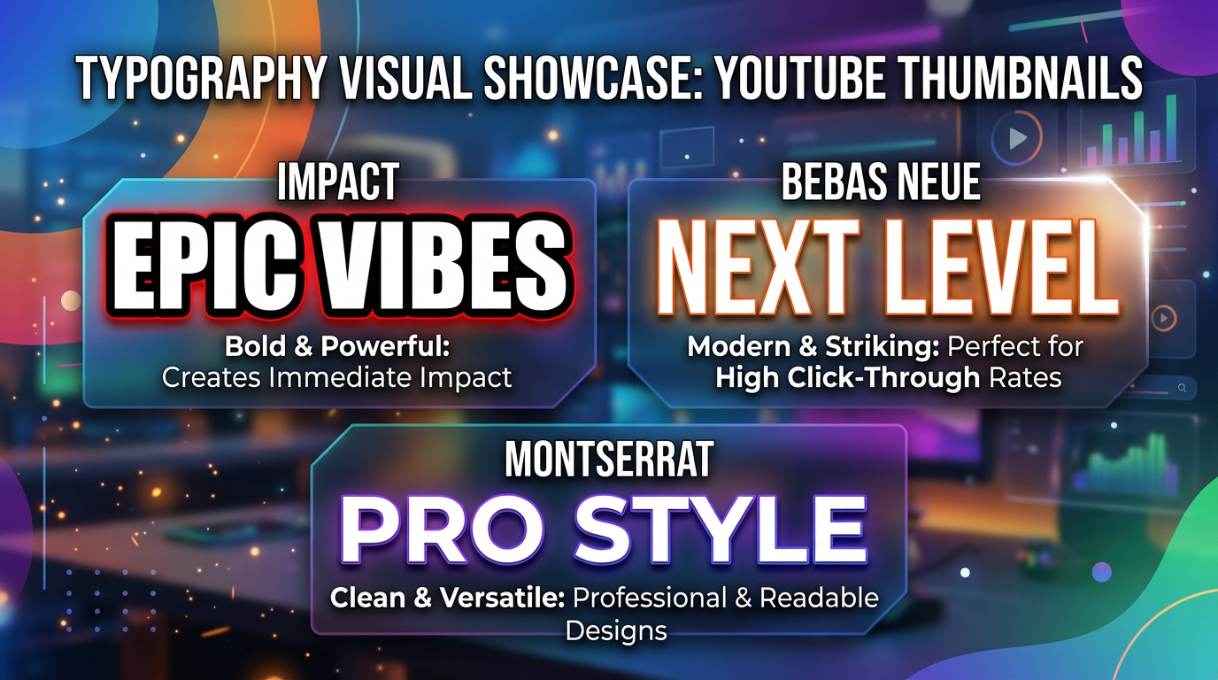
Impact Impact remains the gold standard for thumbnail text. Originally designed for print headlines, its ultra-bold weight and condensed letterforms create maximum impact in minimum space. Nearly every major YouTuber has used Impact at some point.
Bebas Neue Bebas Neue offers Impact's boldness with added sophistication. Its tall, elegant letterforms work particularly well for lifestyle and fashion content. The font's all-caps nature ensures consistency across your thumbnails.
Montserrat Bold Montserrat provides modern geometric forms that feel contemporary without being trendy. Its bold weight maintains excellent readability while the geometric construction creates a professional, polished appearance.
Roboto Bold As Google's signature typeface, Roboto brings credibility and familiarity. Its open forms and friendly curves work well for educational content, tutorials, and how-to videos.
Category 2: Condensed Fonts
When you need to fit more text without sacrificing size, condensed fonts provide the solution.
Bebas Kai This variation of Bebas offers slightly wider letterforms while maintaining condensed proportions. Excellent for slightly longer text that still needs impact.
DIN Condensed DIN Condensed brings technical precision to thumbnails. Its industrial heritage works well for technology, automotive, and DIY content where credibility matters.
Oswald Oswald's reworking of the classic Alternate Gothic style creates a font that reads clearly at small sizes while maintaining character. Its slightly informal feel works for personality-driven content.
Category 3: Display and Decorative Options
For channels where brand identity requires something distinctive, display fonts offer differentiation.
Bangers Bangers brings comic-book energy to thumbnails. Its playful, energetic character works for gaming, entertainment, and reaction content where personality drives viewership.
Permanent Marker This hand-drawn marker style creates authenticity and approachability. Perfect for personal vlogs, casual content, and creators who want to feel relatable rather than polished.
Fredoka One Fredoka One combines boldness with rounded, friendly letterforms. Its playful appearance suits family content, kid-focused channels, and lighthearted entertainment.
Font Pairing Strategies
The Hierarchy Approach
Effective thumbnail typography often uses two fonts: one for primary text, one for supporting information.
Primary Text (Bold, Large) Your main message uses your boldest, most impactful font. This text should dominate the thumbnail—typically 40-50% of the frame height.
Supporting Text (Secondary, Smaller) Supporting text uses a complementary font at roughly 50-60% of primary text size. This might include numbers, brief clarifications, or secondary hooks.
Effective Pairing Combinations
Impact + Roboto Impact handles the attention-grabbing headline while Roboto provides readable supporting text. This pairing works across most content types.
Bebas Neue + Open Sans Bebas Neue's elegance pairs beautifully with Open Sans's neutral readability. Excellent for lifestyle, fashion, and professional content.
Bangers + Montserrat For entertainment and gaming content, Bangers brings energy while Montserrat keeps supporting text clean and readable.
Pairing Pitfalls to Avoid
Too Many Fonts: Never use more than two fonts in a single thumbnail. Each additional font adds visual complexity that reduces impact.
Conflicting Styles: Fonts should complement, not compete. Pair bold with regular, condensed with standard, display with simple.
Inconsistent Pairings: Choose font pairs and use them consistently across your thumbnails. This builds recognition and brand identity.
Typography Best Practices
Text Size Guidelines
Minimum Height: Text should occupy at least 15-20% of thumbnail height for readability on mobile.
Optimal Range: 30-50% of thumbnail height for primary text creates strong impact without overwhelming visual elements.
Supporting Text: Keep secondary text above 10% height—anything smaller becomes illegible on mobile.
Stroke and Shadow Effects
Text Stroke: Add a 3-5 pixel stroke in a contrasting color to ensure text readability against any background.
Drop Shadow: Subtle drop shadows create depth and lift text from the background. Use sparingly—overused shadows look amateur.
Glow Effects: For dark thumbnails, outer glow effects can improve text visibility without hard edges.
Color Contrast Rules
High Contrast: Text color should contrast strongly with background. Light text on dark backgrounds or vice versa.
Avoid Busy Backgrounds: When backgrounds are complex, add solid color overlays or blur to create contrast zones for text.
Color Psychology: Text color can reinforce your message—red for urgency, blue for trust, yellow for energy.
Letter Spacing and Line Height
Letter Spacing: Slightly increased letter spacing (tracking) improves readability at small sizes. Tight spacing creates visual crowding.
Line Spacing: For multi-line text, increase line height to 120-150% of font size. Tight line spacing makes text blocks hard to read.
Avoid Condensed Spacing: Resist the temptation to squeeze letters together to fit more text. Instead, reduce word count.
Mobile Optimization Techniques
The Mobile Preview Test
Before finalizing any thumbnail:
- Shrink your design to 2 inches wide (actual mobile display size)
- View on your phone screen in bright light
- Ask: Can I read this instantly without squinting?
If text fails this test, increase size, simplify font, or reduce word count.
Safe Zone Considerations
YouTube overlays interface elements on thumbnails:
- Video duration badge (bottom right)
- Progress bar (bottom)
- Channel elements (varies)
Position text to avoid these overlay areas, particularly for longer videos where duration badges are larger.
Font Weight for Mobile
Minimum Weight: Use bold or heavy weights. Regular and light weights disappear on mobile screens.
Avoid Thin Fonts: Even some "bold" fonts have thin stroke variations that fail at small sizes. Test specifically at thumbnail dimensions.
Common Typography Mistakes
Mistake 1: Too Much Text
The most common thumbnail typography error is trying to say too much. Viewers won't read sentences—hooks and keywords only.
Solution: Limit to 3-5 words maximum. If you need more words, your thumbnail concept needs simplification.
Mistake 2: Decorative Font Overuse
Fonts designed for logos or print headlines often fail at thumbnail sizes. What looks beautiful full-size becomes visual noise when shrunk.
Solution: Test every font choice at actual thumbnail size before committing. Beauty doesn't matter if viewers can't read it.
Mistake 3: Inconsistent Typography
Random font choices across your thumbnails prevent brand recognition. Viewers should recognize your content instantly by visual style.
Solution: Establish 1-2 primary fonts for your channel and use them consistently. Create templates that enforce consistency.
Mistake 4: Ignoring Letter Case
All-caps text dominates thumbnail design for a reason—it creates uniform height and maximum impact.
Solution: Use all-caps for primary text. Reserve mixed-case for supporting text where readability matters more than impact.
Font Resources for Creators
Free Commercial-Use Fonts
Google Fonts: Extensive library of free, commercial-use fonts optimized for screen display. Montserrat, Roboto, and Oswald are standout choices.
DaFont: Large collection with filtering for commercial-use licenses. Verify license before use.
Font Squirrel: Curated collection of free commercial-use fonts with reliable licensing.
Premium Font Options
Adobe Fonts: Included with Creative Cloud subscription. Access to professional typefaces like Myriad, Franklin Gothic, and countless others.
MyFonts: Massive marketplace with professional options for every style and budget.
Typography Checklist for Every Thumbnail
Before publishing, verify:
- Text readable at 2-inch width (mobile size)
- No more than 5 words total
- High contrast between text and background
- Consistent font choices with previous thumbnails
- Text stroke or shadow for readability
- All-caps for primary text
- Supporting text at 50-60% of primary size
- No text in overlay danger zones
Conclusion: Typography as a Competitive Advantage
Font selection in YouTube thumbnails isn't just aesthetic preference—it's strategic communication. Every choice either helps viewers understand your value proposition or creates friction that costs clicks.
The best approach combines proven fonts like Impact and Bebas Neue with consistent application across your channel. Build templates that enforce your typography rules. Test every design at mobile sizes. Trust data over assumptions about what "looks good."
Remember that your thumbnail competes with dozens of others for attention. Typography that reads instantly gives you an advantage many creators overlook. Master this element, and you've solved a problem most channels don't even realize they have.
Ready to optimize your thumbnail typography? Start by auditing your current thumbnails against this guide. Identify the fonts performing best, standardize on those choices, and watch your click-through rates respond.
jackyi
YouTube content strategist and thumbnail optimization expert. Passionate about helping creators grow their channels through data-driven design and SEO best practices.